Side project · Open source · 2024–present
Zabi Components
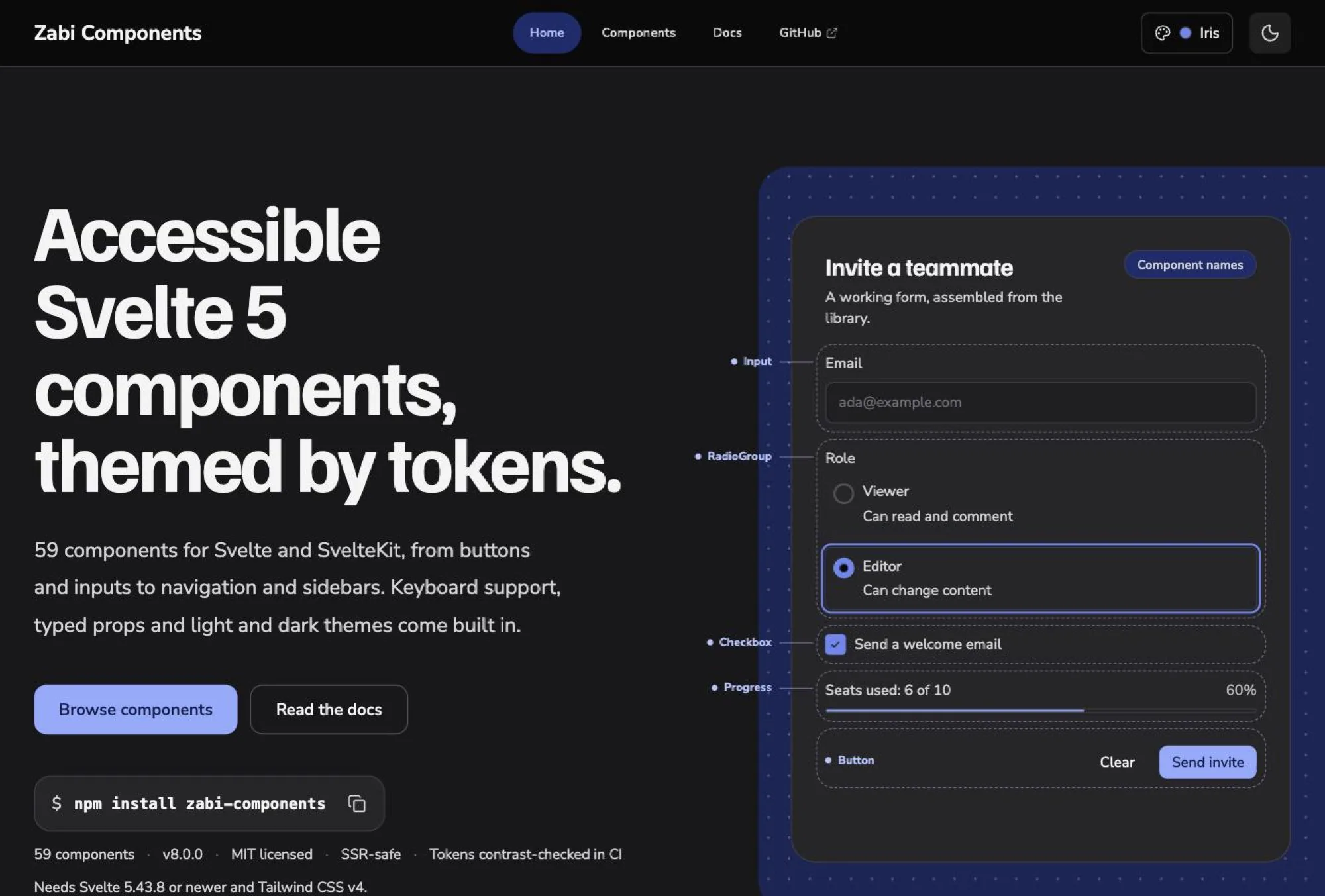
A Svelte 5 component library on npm that I designed and built, themed by tokens.
By Sabina Nordell, Senior UX/UI Designer
- Role
- Design and build, solo
- Tools
- Svelte 5, SvelteKit, TypeScript, Tailwind CSS v4, Storybook
Why I built it
I was getting the accessibility details slightly wrong on every project, in a different way each time.
So I built them once. On npm as zabi-components, MIT licensed, currently v8.
I could have used an existing library. I built my own because writing the accessibility patterns myself was the way to understand them. I also wanted theming through semantic tokens, and to own the design and the code together.
What’s in it
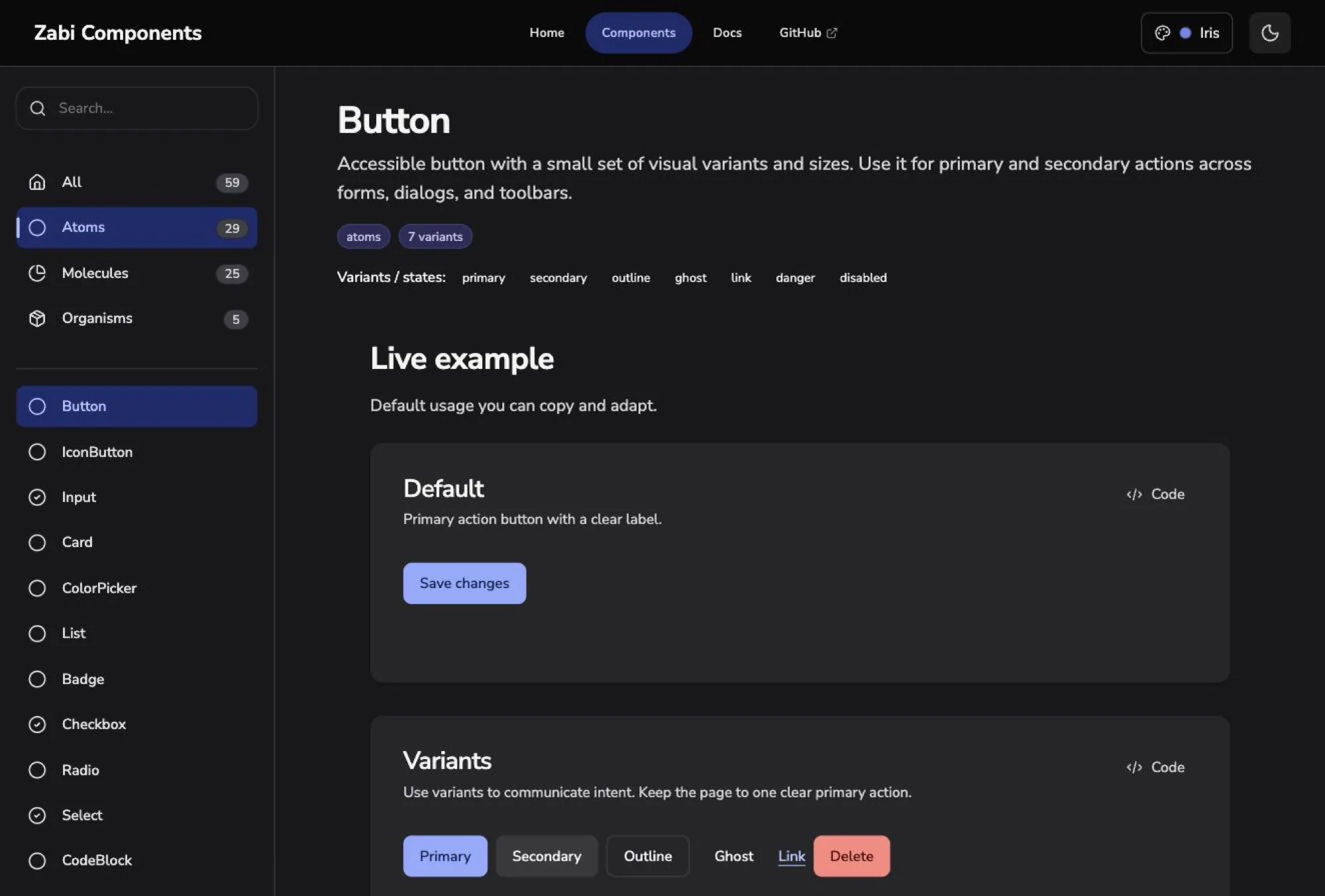
59 components for Svelte and SvelteKit: 29 atoms, 25 molecules, 5 organisms.
The organisms are the ones that save real time. A top navigation bar, and a sidebar with search and an account panel, already assembled from the same atoms you would otherwise wire together yourself.
Themed by tokens
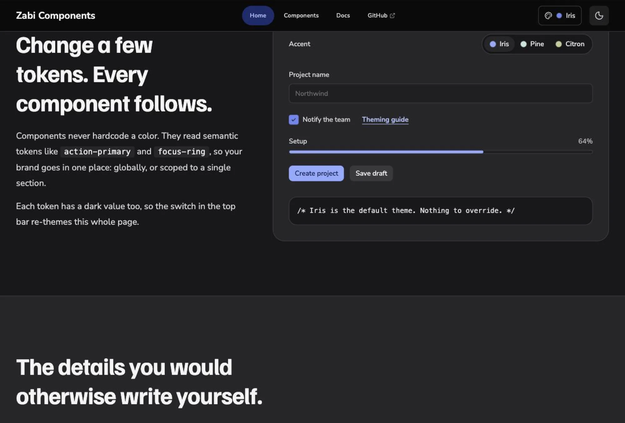
Nothing hardcodes a colour. Components read semantic tokens like action-primary and focus-ring, scoped globally or to a single section.
Contrast ratios are checked in CI. A change that breaks contrast fails the build instead of shipping.
Dark values. The names stay the same.
The details you would otherwise write yourself
RadioGroup moves on the arrow keys. Dropdown handles arrows, Home, End and Escape. Modal keeps focus inside while open and returns it to the button that opened it, including when modals are nested.
Input, Textarea and Select wire labels, hints and errors to the control so a screen reader reads them together. Everything renders server-side in SvelteKit with browser APIs guarded, and every prop is typed.
Click into a control, then use the arrow keys.
RadioGroup
Size
Dropdown
Key log
- Nothing yet.
In a real product
It now runs a real product end to end. Zabiro, the CMS I built next, uses it for its whole interface. Most of what shipped in later versions came from hitting a wall there first.
One wall was light mode. I had gone dark mode first, and that caused problems when light mode came. Surface layers were the hard part: getting semantic tokens that work in both light and dark.
What I’d do differently
Eight major versions is too many breaking changes. I’d settle the API and the token names before publishing.
I’d build a real product on it from the start, not design components on their own. And I’d test with real screen readers earlier, and rely less on automated checks.
Project images
About the author
I’m Sabina Nordell, a Senior UX/UI Designer in Stockholm. Want to talk about this project, or one of your own?