Univid · SaaS, virtual events · 2021
A brand that’s playful and professional at once
Brand identity, an early design system and my first shipped code at Univid.
By Sabina Nordell, Senior UX/UI Designer
- Role
- UX/UI Design Intern, across brand, product design, and front end
- Tools
- Figma, HTML, CSS, JavaScript, Hotjar
The brief
Univid made software for virtual events and was growing fast. Its older brand no longer fit where the company was heading. The new one had to be playful and professional at once, and the team needed a system it could keep building on.
It was my first software product role. I wrote the brand guidelines: the basic elements of the brand design system, for product and marketing.
Three principles
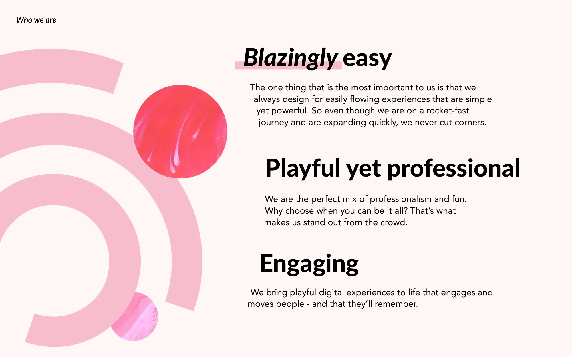
Blazingly easy: simple, flowing experiences, with no cut corners even while the company grew fast. Playful yet professional: fun and serious in the same product. Engaging: experiences that move people and stay with them.
The rest of the guidelines build on them.
Blazingly easy
Simple, flowing experiences, with no cut corners even while the company grew fast.
Playful yet professional
Fun and serious in the same product.
Engaging
Experiences that move people and stay with them.

Logo, colour, type and tone
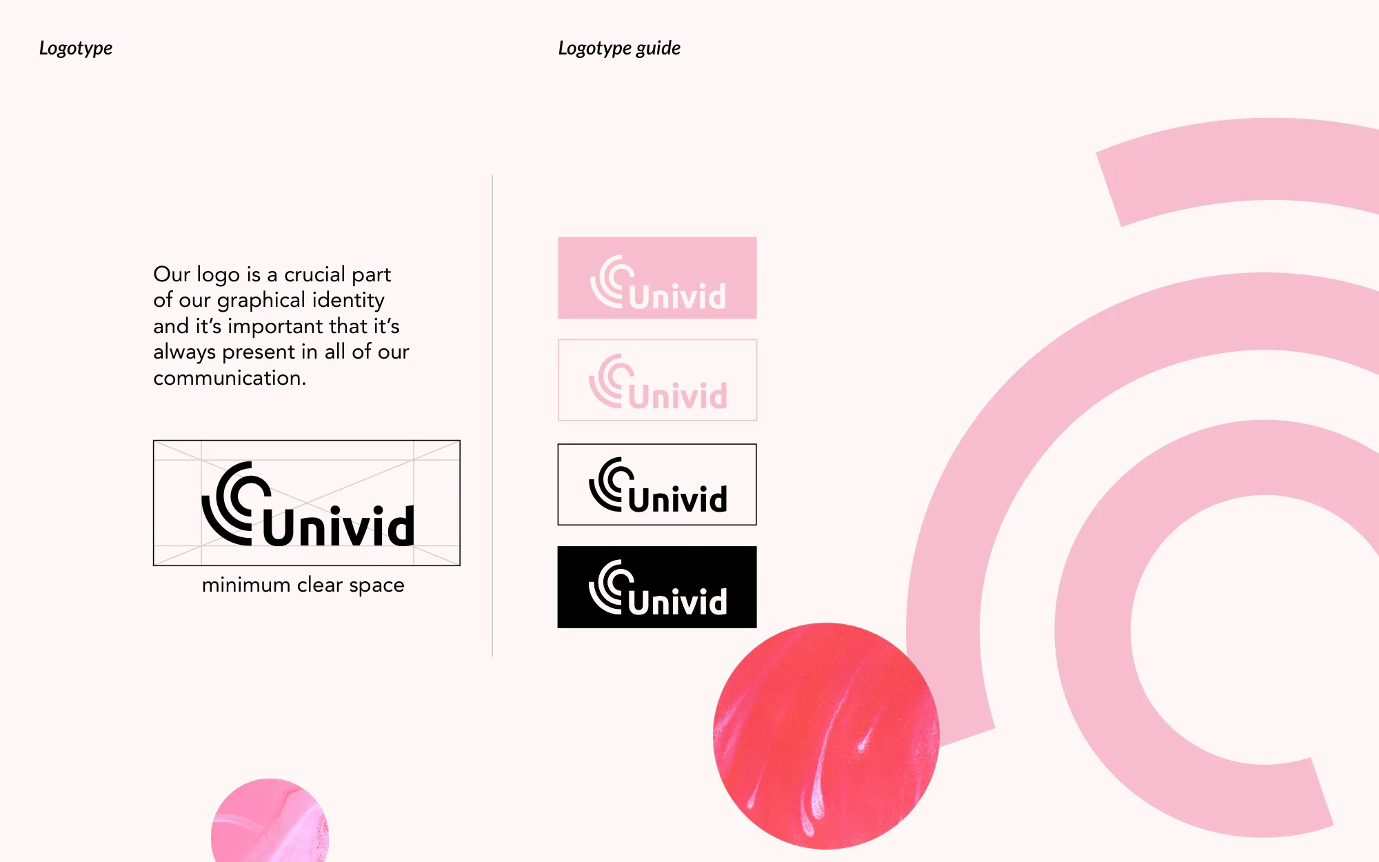
The logo appears in all communication, with a set clear space around it. Its shapes also work on their own, so content carries the brand without spelling out the name. With the textured planets I made, they form an illustration with depth.
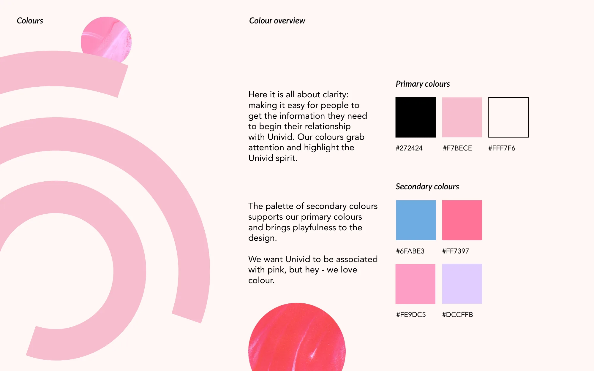
Pink is the colour people should connect with Univid. The primary colours are there for clarity, and the secondary palette adds play.
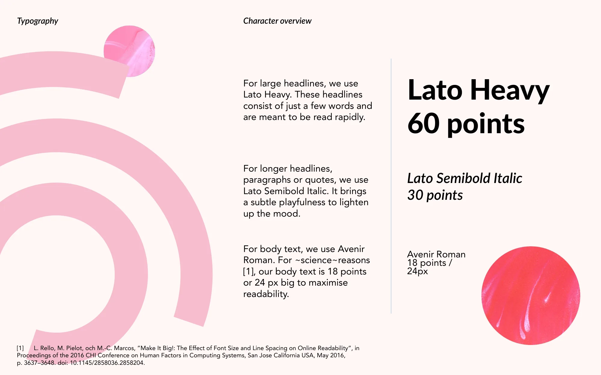
Lato Heavy sets short headlines meant to be read at a glance. Lato Semibold Italic lightens longer headlines and quotes. Body text is Avenir Roman at 18 points (24 px), a size taken from “Make It Big!”, Rello, Pielot and Marcos’s CHI 2016 study on font size and online readability.
The tone is clear, friendly and punchy: get to the point, skip jargon, write as if talking face to face. A short dictionary of space words, like rocket-fast and moon shot, keeps the copy in the brand’s world.
Get to the point. Skip the jargon. Write as if you were talking face to face.
24 px (18 pt)
In the product
I also designed end-to-end flows, ran usability tests in short cycles, and watched Hotjar recordings to see where people got stuck.
The same things kept coming up. People got stuck in sign-up and onboarding, missed controls they needed, and were confused by labels and instructions. I fixed those in the front end myself, in HTML, CSS and JavaScript, and rewrote the copy.
That’s where I learned to work next to developers while a design is still moving, and where “done” stopped meaning “looks finished in Figma.”
Looking back
The team kept building on the guidelines after my internship, and the brand has changed since.
I chose the pink by eye. Today I’d test the palette for contrast first, and I’d deliver the system as tokens and components in Figma and code, not only as a guideline document.
I’d put designs in front of users before they were built, not fix them after release. And I’d take on less. Brand, product and front end at once was too wide to go deep on any of them.
Get to the point.
Skip the jargon. Write as if you were talking face to face.
1.50:1Fails for body text and large text
- Body text, needs 4.5:1: fails
- Large text, needs 3:1: fails
Project images
About the author
I’m Sabina Nordell, a Senior UX/UI Designer in Stockholm. If your team has a problem like this one, I’d like to hear about it.