· Updated
Tailwind Breakpoints with Figma Variables
- Tailwind CSS
- Figma
- Figma variables
- Responsive design
- Figma tips
I couldn’t find anything about this online, so I figured I’d write it myself.
Handling responsive design in Figma efficiently can be surprisingly complex. I’ve been puzzling over this for a while trying to find the most efficient approach that aligns with our design system.
Like many teams, my company uses Tailwind CSS (opens in a new tab). Unfortunately, there’s no magical Figma plugin that fully synchronizes your Tailwind breakpoints, tokens, and component behavior in one clean setup. If there is one, please let me know.
But if you’re like me and want to bridge the gap between your design tooling and your codebase using native Figma Variables (which we all know and love), I’ve got something that might help.
Step 1: Create a Breakpoint Variable Collection
Start by creating a variable collection in Figma called something like Breakpoints. Within that, define the standard Tailwind breakpoint sizes: sm, md, lg, and xl.

This simple table becomes extremely useful when applied consistently across your layout frames. For example, by assigning a page padding variable to your main container, you can quickly prototype how content reflows across breakpoints.
Mode: lg
Step 2: Define Component-Specific Variables
Next, create a second variable collection for your core components. I’ll use cards as the example here, since they’re a common responsive element.
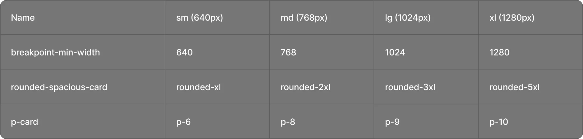
With these variables set up, you can now apply them directly to your card components and use mode switching in Figma to simulate different screen sizes. Just like media queries in Tailwind.
| Name | sm (640px) | md (768px) | lg (1024px) | xl (1280px) |
|---|---|---|---|---|
| rounded-spacious-card | rounded-xl | rounded-2xl | rounded-3xl | rounded-5xl |
| p-card | p-6 | p-8 | p-9 | p-10 |
md:p-8
Card padding is crucial for a visually appealing layout. It creates space between the card’s content and its border, allowing text and images to breathe.
Padding classes: sm:p-6md:p-8lg:p-9xl:p-10
Corner radius classes: sm:rounded-xlmd:rounded-2xllg:rounded-3xlxl:rounded-5xl
md: padding p-8 (32 px), corner radius rounded-2xl (16 px).
Why This Matters
This technique may feel a bit manual upfront, but it pays off in scalability and developer alignment. Using Figma Variables with Tailwind logic improves the semantic consistency of your designs and bridges the often painful design–dev gap.
According to NNG, reducing ambiguity between design and code is one of the top UX challenges in cross-functional teams. This approach makes breakpoints visual and shared across designers and developers.
It also reinforces one of the fundamental principles of responsive design: flexibility with constraints. By anchoring your components to breakpoints through tokens, you maintain consistency across devices while allowing for tailored adjustments. Pretty nice!
TL;DR
Figma Variables + Tailwind breakpoints = a scalable way to simulate responsive design without plugins or hacks.